
Z Northface
Where business finds its north.
One mark. Many forms..
A symbol distilled from interlocking triangles and a North Star revealed in negative space — paired with a wordmark engineered for stability, and a pattern system that scales across architecture, signage and digital.

What they came with.
Z Northface arrived as a premium commercial real-estate ambition — not just office space, but a destination where businesses discover direction. The brand had to read as confident without shouting, premium without ornament, and structured enough to scale across architecture, signage, hoardings, business cards and digital. The brief, in one line: don't design a logo, build an identity that buyers, tenants and partners can stand under for a decade.
What we built.
Positioning audit.
We started with a positioning audit. Out came one line every visual decision had to defend — a compass-flavoured promise that explains why a tenant should sign here and not somewhere down the road.
Naming.
Named the development Z Northface — premium commercial destination, anchored to a compass metaphor that already lives in the buyer's vocabulary. The wordmark was drawn to be intentionally wide and uncomplicated: strength through bold weight, clarity through restraint, timelessness through minimal design.
Symbol construction.
The icon was built from one geometric module. Triangles → interlocking pairs → a connected network → and in the negative space, an 8-point North Star reveals itself. The final mark isn't drawn from the outside in — it's discovered by the eye, the way a tenant discovers direction after walking the floor.
Color system.
A disciplined palette around two anchors. Dark Gunmetal carries the structural-steel confidence of the architecture itself. Rodeo Dust brings the warmth of natural stone and sandstone craftsmanship. Platinum and Spring Wood handle breathing room — the white space of a brand that knows when to stop talking.
Typography.
Titillium Web for ambition — architectural, structured, future-ready; a typeface that doesn't just communicate, it represents. Inter for clarity — minimal and digital-first, so the brand voice stays effortless across every screen the building will end up on.
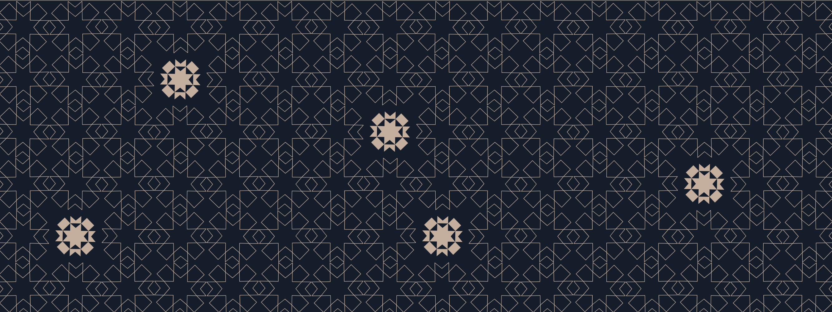
Pattern system.
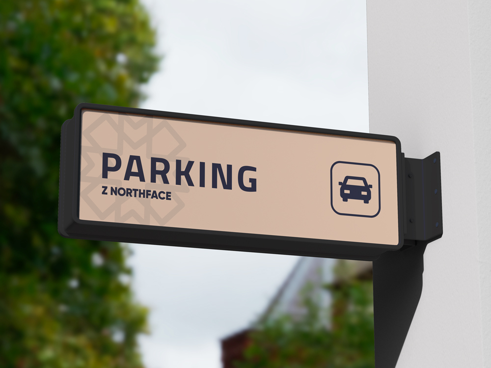
The same geometric module that built the symbol — repeated, tessellated, scaled. The brand reads as one even when split across a hundred touchpoints: hoardings, business cards, signage, the digital surface. Architecture should not merely occupy land. It should shape communities.
The brand, in use.
From wayfinding to wallet — the same geometric module shows up at every scale of the experience. Premium where it matters, restrained where it should be, recognisable everywhere.
Quantloop gave us more than a logo. They built a lasting identity with strong naming, a meaningful symbol, refined typography, and a visual system that scales from cards to hoardings.
Where it landed.
A brand that holds its own against the architecture it represents. The North Star sits in the negative space of every application — a quiet reminder that Z Northface is where business finds its direction.