
Case study — 07 / Beauty · Branding & Packaging
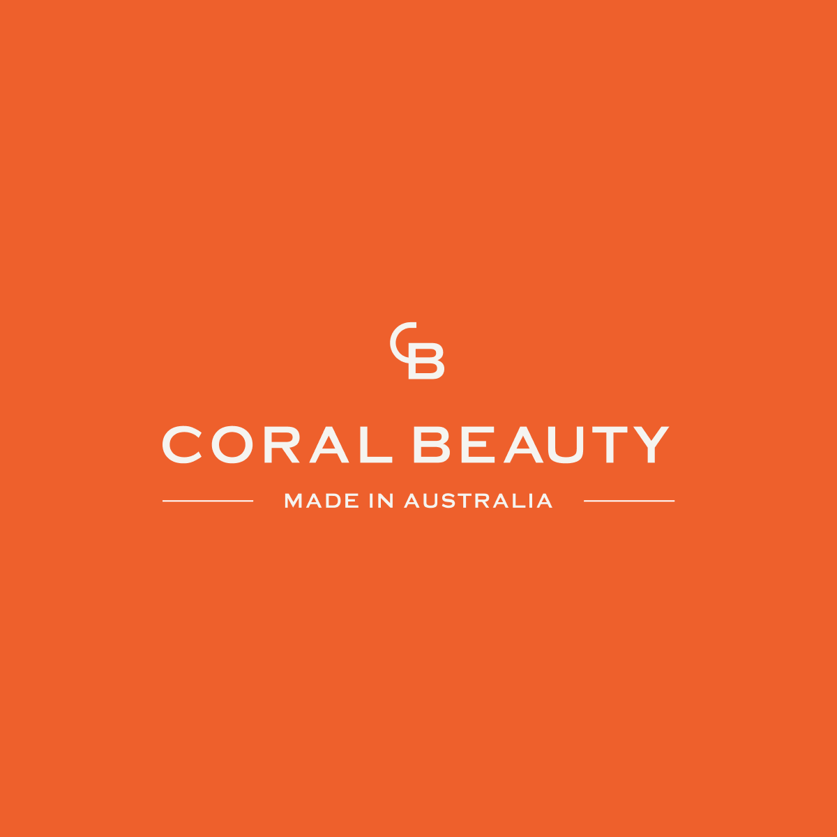
Coral Beauty
Gentle by nature. Premium by design.
Services
Brand IdentityPackaging SystemVisual Language
Selected work
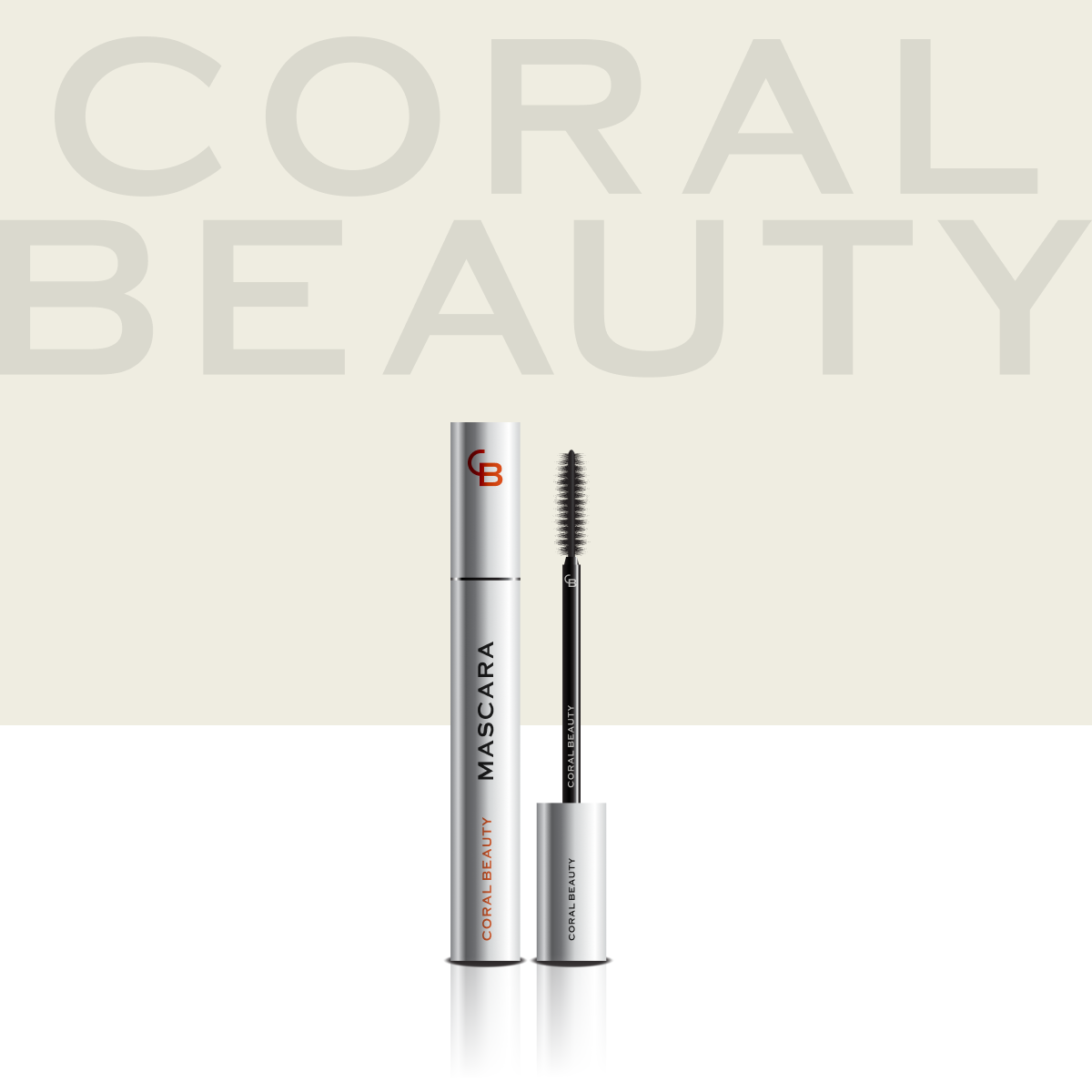
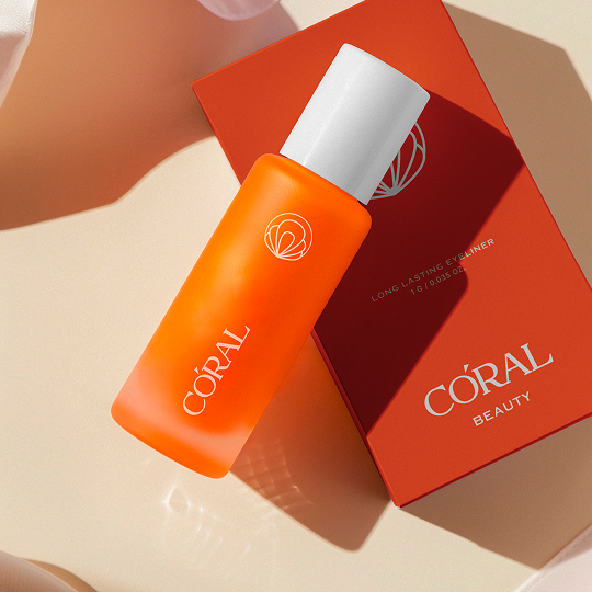
The system, in product..
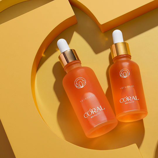
Six signature SKUs styled on the same brand grammar — Coral against warm cream, neutral black and a disciplined trust-badge system.
The signal
What they came with.
A South Yarra beauty professional realised the lash and brow shelf was over-formulated, over-claimed and under-considered. Coral Beauty needed a brand identity that read as premium and clean — not loud — and a packaging system disciplined enough to scale across SKUs without diluting the line.
The loop
What we built.
- 01Defined a single-line brand position — "Gentle by Nature. Premium by design." — and built every decision around it.
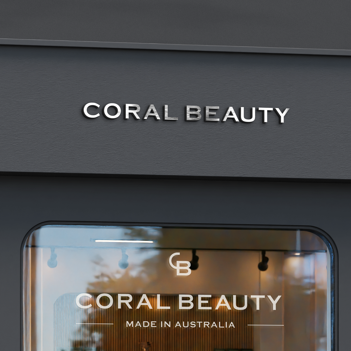
- 02Designed a CB monogram + Coral Beauty wordmark that holds up from product cap to retail display.
- 03Locked a restrained palette led by Coral (#EE602C) against warm cream, off-white and neutral black, with olive and soft-blue accents used sparingly.
- 04Paired Work Sans for digital systems with Barlow Condensed for packaging — quiet on the front, useful on the back.
- 05Authored a "less claims = more luxury" packaging system: one hero line on the front, 3–5 standardised trust badges on the side, ingredients and directions on the back.
The outcome
Where it landed.
Six signature SKUs that look like the same brand from across the shop — premium, accessible and recognisably Coral. Trust now lives on the packaging, not in the claims.
Want one of these?